News
Android Developers Detail Galaxy Z Fold8 App Strategy
Google is urging Android developers to rethink layouts, camera flows and on-device intelligence as Samsung’s latest foldables expand the platform’s range of screen shapes and postures.
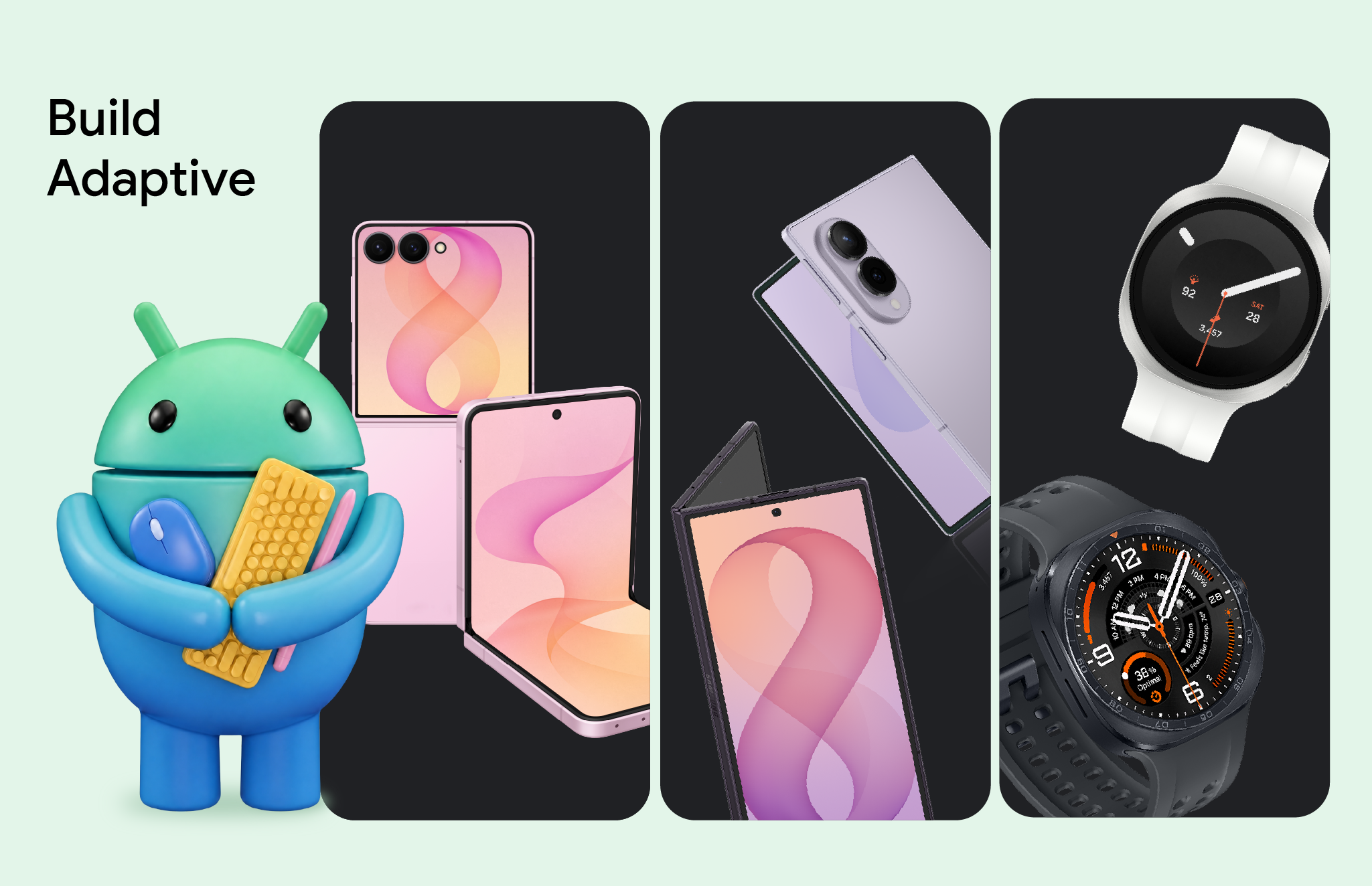
Android app developers are being asked to rethink how their applications respond to changing screen shapes, orientations and device postures. In a new Android Developers guidance post, Google outlines the engineering work needed for Samsung’s latest foldable and wearable devices, with the Galaxy Z Fold8 presented as a particularly important example.
The central challenge is that a foldable is not simply a larger phone. The Galaxy Z Fold8 introduces a landscape-first natural orientation and a wider main-screen aspect ratio. An application designed around fixed portrait assumptions can therefore waste space, break navigation or place important controls in awkward positions when the device is unfolded, partially folded or used in a multi-window layout.
Window size matters more than device size
Google’s advice is to design around the space that the application actually receives rather than the physical dimensions of the handset. That distinction becomes important when a foldable is running split-screen, floating windows or other multitasking modes. The available application area can be narrower or differently oriented than the full display.
The recommended foundation is an adaptive layout that responds first to window width and then to available height. Flexible containers should be able to wrap, span and reflow content instead of relying on hardcoded coordinates. Google points developers toward its adaptive design guidance, Window Size Classes and the dedicated guidance for landscape foldables and trifolds.
The post also highlights recent Jetpack Compose tooling. Developers can combine the newer Grid and FlexBox layout APIs to manage dynamic tracks, column spans and multi-axis wrapping. Google also recommends using MediaQuery to detect environmental signals such as posture, window size and keyboard type. Together, these tools are intended to make layout decisions explicit and reusable across phones, foldables, tablets and connected displays.
Fold awareness must include continuity
Foldable support is not only a visual problem. Applications also need to understand where hinges and folds are located. With the Jetpack WindowManager library, developers can detect these features and avoid placing essential content across a hinge. A fold can also become a useful divider between content areas, such as a list and a detail view.
Google separately stresses continuity. When a user unfolds a device, an application should preserve its current task instead of unexpectedly restarting or losing interface state. The guidance recommends using ViewModel to retain UI state through configuration changes, helping users continue reading, editing or navigating without repeating their previous actions.
Camera previews need a different approach
Camera applications face a particularly visible problem on foldables. Moving between an outer cover display and a larger inner display changes the preview’s aspect ratio even when the sensor itself has not moved. If an application assumes that the camera preview is always portrait-shaped, the result can be a sideways, stretched or cropped image during a folding transition.
Google recommends migrating capture experiences to CameraX. Its PreviewView is designed to manage sensor orientation, device rotation and scaling, reducing the amount of device-specific transformation code developers need to maintain. Teams that still depend on Camera2 can use the CameraViewfinder library to handle those transformations without replacing their entire camera architecture.
The larger ecosystem reaches the wrist
The guidance extends beyond foldable phones. With Wear OS 7, Google is opening additional glanceable surfaces through Wear Widgets. Developers can create these experiences with Jetpack Glance and RemoteCompose, while multi-widget tiles can now be populated by applications beyond Google’s own first-party software.
That matters because users increasingly move between a phone, a foldable cover screen and a watch during the same task. A travel application, for example, may need to show a complete itinerary on an unfolded display, a focused next step on the cover screen and a single timely update on the wrist. Treating those surfaces as separate but connected experiences is more resilient than shrinking the same phone layout everywhere.
On-device intelligence becomes another design surface
Samsung’s new foldable devices also ship with Gemini Nano 4, according to Google’s developer guidance. The post points developers to ML Kit’s Prompt API and features such as structured output and thinking mode for on-device intelligent experiences. Google says Nano 4 supports more than 140 languages and improved multimodal understanding.
The practical implication is that AI features should be planned alongside layout and lifecycle decisions. A receipt parser, travel summary or voice-note feature may run locally for privacy and responsiveness, while the surrounding interface still needs to adapt across screen sizes and postures. Developers should therefore treat local inference, state retention and responsive layout as parts of one application architecture rather than isolated upgrades.
Google’s message is straightforward: the newest Galaxy hardware raises the cost of ignoring adaptive design. Applications that measure their real window, understand folds, preserve state and handle camera orientation correctly will be better prepared for the Galaxy Z Fold8 and for the wider range of Android form factors that follows.