News
Google gives Noto Emoji a 3D redesign built for richer expression
Google has reimagined its Noto Emoji library in 3D, adding richer expression, improved contrast and open-source models for creators.
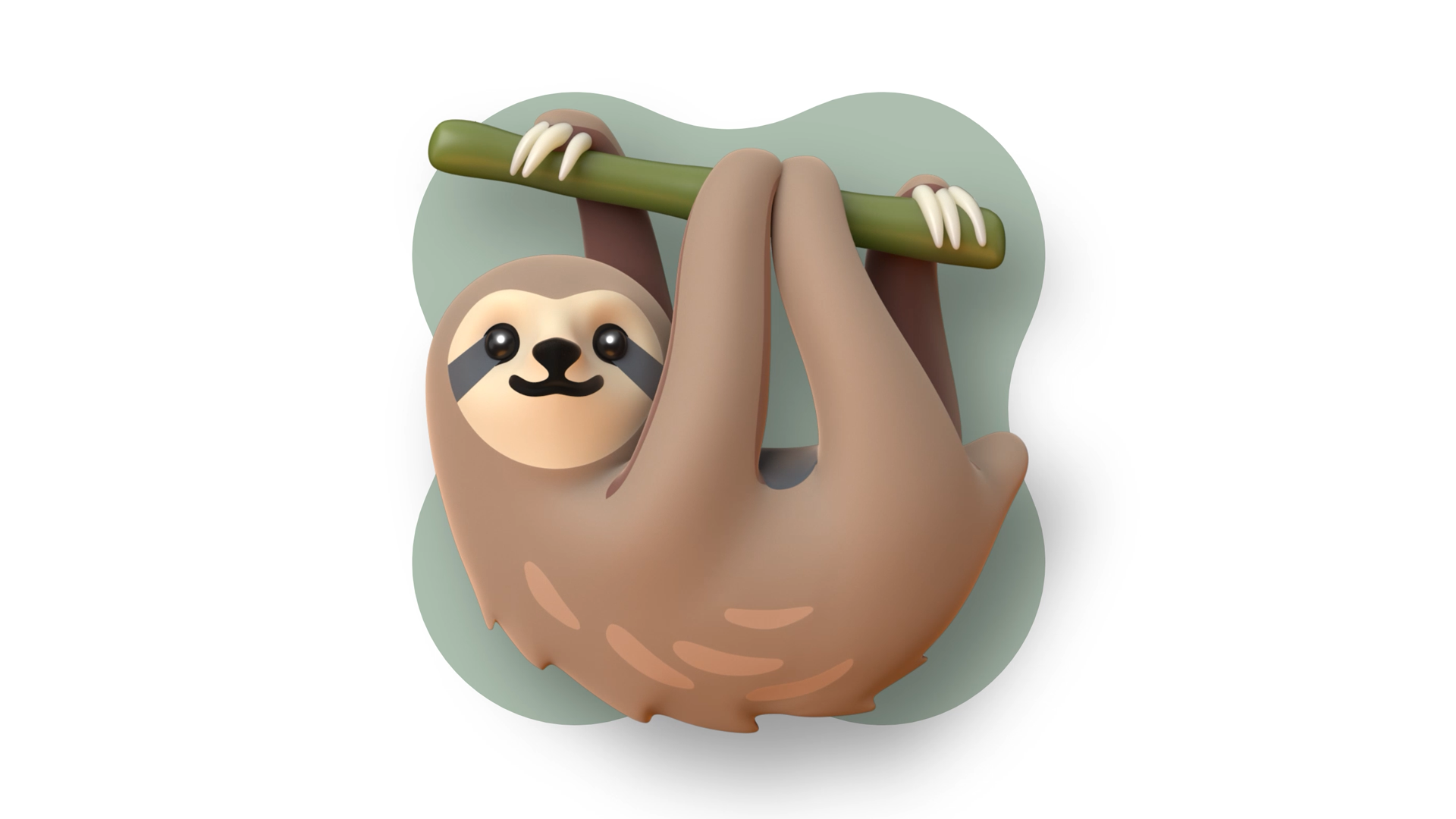
Google is giving one of the most familiar parts of Android’s communication layer a substantial visual rethink. In a new official Android announcement, the company has detailed Noto 3D, a redesigned emoji library intended to make digital expression more nuanced, accessible and adaptable across modern creative projects.
The update covers all 3,977 characters in Google’s Noto Emoji portfolio. Rather than simply adding depth to existing artwork, the design team says it reconsidered how emoji communicate emotion on small screens. The resulting characters use richer expressions, more physical volume and a deliberately playful style that aims to preserve the clarity of the original symbols.
Why Google is moving emoji into 3D
Emoji have changed from literal pictograms into a kind of visual subtext. A face, hand gesture or animal can soften a message, signal irony or communicate an exaggerated reaction that would take several sentences to explain. Google argues that the design language therefore needs to reflect how people actually use emoji today, not just what each symbol technically represents.
The company points to changes in usage data from Gboard Federated Analytics. According to Google, the face with tears of joy has declined over several years and had slipped down the rankings by 2025, while the loudly crying face and rolling-on-the-floor-laughing face better reflect the dramatic and hyperbolic tone common in online conversations. The examples illustrate the design challenge: an emoji must remain immediately recognisable while carrying a more specific emotional temperature.
Google says the move to 3D does not mean making emoji photorealistic. The team chose illustration over anatomical precision, using dimensional forms to give characters more presence without making them feel cold or overly technical. That approach is particularly visible in the animal designs, where expressive silhouettes and readable gestures matter more than realistic proportions.
Accessibility is part of the redesign
One of the more practical changes concerns contrast in dark mode. Google says emoji with darker skin tones can become difficult to distinguish against dark interfaces, which can make otherwise familiar symbols less legible. To address that problem, the company developed an AI-powered contrast tool that analyses each emoji at pixel level, identifies weak contrast and suggests possible improvements for designers.
The tool does not replace the design process. Instead, it helps the team find cases that may be easy to miss during ordinary review. Designers then decide how to adjust the artwork while preserving the intended expression and skin-tone representation. This matters because emoji are often displayed at small sizes, where a minor colour change can affect whether a gesture or facial detail remains readable.
Google also describes user studies that influenced the redesign. The research found broad preferences for full-body animals rather than floating heads, while added props could make some symbols harder to understand. The company says even small changes, such as reversing the direction of a wink, can create confusion or change the perceived meaning of a message.
Open-source models extend the project beyond Android
The most notable part of the announcement is that Noto Emoji 3D is not being presented only as a phone interface refresh. Google says the project is making raw OBJ files available to the wider community. Developers, artists and hobbyists can use the models in independent apps, virtual reality environments, visual experiments and other projects.
That open-source approach gives the redesign a wider role than a conventional system-font update. A developer could adapt the models for an app interface, an educator could use them in an interactive lesson, or a creator could build a custom scene around a familiar emoji character. The source files also allow people to inspect, remix and reinterpret the designs instead of treating them as fixed assets.
There is a clear technical reason for that flexibility. Flat emoji are optimised for fast communication inside messaging and keyboard interfaces, but three-dimensional assets can also be animated, lit, rendered from different angles or placed inside immersive environments. Google calls Noto Emoji 3D an industry first because the complete collection is available as true 3D models rather than as a set of flat images with simulated depth.
What the announcement means for mobile users
For everyday Android users, the immediate significance is less about a single new feature and more about the direction of mobile communication design. Emoji are now expected to work across messaging apps, social platforms, stickers, video tools and emerging spatial interfaces. A design system that can remain expressive at phone size while also supporting 3D creation gives developers more room to build consistent experiences across those contexts.
The announcement does not promise that every app will instantly replace its existing emoji artwork, and Google does not present Noto 3D as a universal change to every platform. Its confirmed contribution is the redesigned artwork, the accessibility work behind it and the release of the underlying 3D models for broader use.
That makes Noto 3D a quietly important Android story. Emoji may be small, but they sit inside some of the most frequently used features on a smartphone. By treating them as a living design language—and by opening the models to creators—Google is positioning the next generation of emoji for richer messaging, more accessible interfaces and a wider range of mobile applications.